Typography Fix – Landscaping Truck

A few weeks back I was driving and saw this landscaping truck in front of me.LandscapingTruckSmall
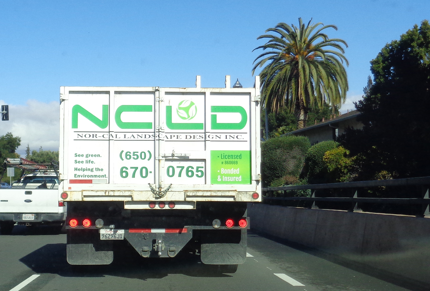
The logo font says “Space Exploration” to me much more than “Landscaping”.  Besides the inappropriate logo font, there are four other fonts on the back of this truck. Now the general rule is to only have two font. There are times when this rule can and should be broken, but this isn’t one of them.

I decided to use a little Photoshop magic and show what the truck might look like using just two more appropriate fonts.  LandscapingTruckSmall Sesame FontThe logo font is Sesame by Dieter Steffmann. I chose it because the organic feel I felt was more appropriate for a company working with plants.

The font for the rest of the text is Overlock by Dario Manuel Muhafara. It is a sans serif font that has a more modern feel, but with handwriting like qualities that again lend an organic feel appropriate to growing things.


Friday Challenges – On the Wing & Amnesty

Back to Samples Page

Here it is, what you’ve all been waiting for! Finally, another Friday Challenge post. If you’re new to the blog, you can view some previous ones to come up to speed. Otherwise, without further adieu, let’s dive in.

On the Wing
For Caplin’s 511th Friday Challenge he gave HotChiPs forum members this picture to work on: wingman

The narrative and his instructions were:

I’m indebted to Vibeke for this week’s image, which features a tourist sitting on the wing of a plane. He looks very relaxed here – but how laid-back would he be if the plane were up in the air? Can you make this plane fly?

I have to admit I received considerable direction from Gordon Bain, who not only is a forum member but also a pilot and photographer.  He gave me tips on how the propeller would look if it were photographed while spinning.  I have to say my image wouldn’t have come out as well if not for his advice.

OnTheWingMy caption for the image:

Clement always felt like his late mechanic, George, was with him whenever he flew and disapproving, as always, on how he was handling the plane.

Here is what Caplin had to say about my submission:

A great spin from srawland, and a very neatly inserted background. I like the way you’ve turned the man into a ghost sitting on the wing – subtly achieved, a clever idea.

The hardest part about this image was getting the propeller to look as if it had been photographed spinning.  I used the motion filter but had to run it several times at different settings until the image finally looked right.  Thank you, again, Gordon!

Friday Amnesty – A Fountain Revisited
The 512th Friday Challenged coincided with the 10th anniversary of Caplin issuing his first Friday Challenge. Here’s what he had to say:

This week marks the 10th anniversary of the Friday Challenge, which posed its first puzzler on 2nd July 2004. Sadly, a move to a different server means most of the entries for that Challenge have now gone the way of all websites, although the original image still remains.

I’m indebted to Deborah Morley for coming up with this week’s Challenge idea: a global amnesty. She reckons there’s always at least one Challenge everyone thinks they should have entered but missed, or which they did enter but feel they could have done better.

So now’s your chance to revisit any Challenge from the last 10 years, and show us what you can do. Note: please provide a link to the original Challenge in your entry, so I can remind myself of the original image and entries!

Have fun with this one.

I went back  and looked at every Friday Challenge.  I kept coming upon ones where I thought, “Yes, I can do this one!” But, then I’d realize the reason for my enthusiasm was because Caplin had turned the Challenge into a tutorial in his book,   How to Cheat in Photoshop, 6th ed., so I’d completed them as an exercise.  Turns out Caplin sure got a lot of ideas from those Challenges and they weren’t just exercises for us. Very clever.  My only regret was not finding his book and joining the forum sooner.  And, I will never see one of my submissions as an example in one of his books because Caplin says the latest edition is his last. So much for my nanosecond of fame.

After visiting all of the Challenges, I decided to just work on one I had regretted not doing better or trying harder.  I came up with two entries. The first one was from Fill the Fountain.  At the time I had not tried making  spray.  It turned out to be remarkably easy. I should have tried it in the first place!

ChallengeAmnestyFountain I included images from four Friday Challenges that were before my time.  See if you can spot them.

Here is what Caplin had to say:

A fine revisiting of the recent Fountain challenge from srawland, with a neatly cut out spray bursting into the air. And is that someone playing the guitar behind it? I can’t see evidence of the other two Challenges you refer to.

Friday Amnesty – Creative Female Builder Redux
Not satisfied with one entry, I decided to work on another one.  In this case, Caplin had been underwhelmed by my original submission to Challenge 510: Creative female builder which featured an image of a woman standing next to a van that said “Kim Can, Creative Female Builder.” Caplin asked what a female creative builder was and what did she create?

For my original submission, I’d created a back story for Ms. Can. Then, I placed it in an image of on open magazine, subtly modeled after a noted U.S. thought leadership publication, The Atlantic, which I named The Pacific. If you need a magazine layout designer, I’m your woman.

But, it wasn’t what Caplin was looking for. It should be noted the Caplin is also a sculptor. Anyway, here is the explanation for my  second Amnesty submission:

While I didn’t actually miss the “Creative female builder” Challenge, the magazine wasn’t my original idea. The image below was. When I told my sister my idea, she said it was sexist and suggested I come up with something else. I worked hard at making that magazine look realistic, but it used words to tell how Kim was a creative female builder, instead of showing it. I did put this in the Reader’s gallery but it really deserved being here.

ChallengeAmnestyMuseumMy caption for this image was:

We’re all set for the opening on Tuesday, Ms. Can.

Here is Caplin’s Critique:

I’m interested in your second entry, creating a piano and what appears to be an artist out of some sort of shiny plastic material. Good old Plastic Wrap, eh?

Just knowing that I, as such a newbie to Photoshop by comparison, could cause Caplin to wonder how I did something was a huge thrill for me.   I did use the Plastic Wrap filter, but it was the next to the last step in creating the “statues.”  What really gives them that solid acrylic plastic look is the Chrome filter, set to a lowered opacity.

Well, I’ve had so much fun revisiting these that I think next time I’ll cover another set of Friday Challenges.  See you then!

Next: A Desk, A Comedian, and The French Resistance.

Back to Samples Page

Shiny Surfaces – Part 7 – Grimy Windows and a Glass Case

Back to Samples Page

To all  my readers: Thank you for sticking with it and continuing to read this blog. As of March 25, 2015 I have completed all of the tutorials and self-tests in How  to Cheat in Photoshop 6th ed, by Steve Caplin.  Lest my readers worry, there are still lots more material to cover before I run out of things from the book. Even then, there will be  a steady stream of Friday Challenges.  No need to fret. So let’s move on to the final two tutorials in Chapter 9.

Through Grimy Windows
Glass is very difficult to photograph, which is why the majority of tutorials covering glass in Chapter 9 include creating it from scratch.  However, there are times when only real broken glass will do. To overcome the resulting challenges, the easiest thing to do is to cheat.  For example, to avoid a light flare the original image, below, it had to be photographed without a flash, which is why it’s so dark. Significant cheating occurred to accomplish the completed image on the right:

Through a Grimy Window bothFirst, a curves adjustment layer was used to lighten up the room. Then, the glass was selected, moved to a new layer and that layer copied.  One of the glass layers was set to Screen Mode and the other was set to Hard Light.  The opacities were adjusted and, finally, a more dramatic background was added.

 A Refracting Glass Case
The concluding tutorial for Chapter 9 is another instance where Caplin, again, does not supply all the images. Nor does he give all the steps needed to complete the project.  As is common in How to Cheat in Photoshop, Caplin expects his readers to use what they learned in previous chapters to complete this tutorial.

Make no mistake, this was a tough one. And not just because it required combing the Web for images of computer parts.  Indeed, it was also due to Damian Hirst. Caplin must be a fan of Mr. Hirst because this is the third time Hirst’s work is featured in Caplin’s book. In any case, the assignment involved taking the iMac monitor, below, splitting it in half, adding a keyboard (which also needed to be split in half) and then enclosing up the whole thing in a Hirstian box.  I was quite exhausted after finishing this one.

Besides splitting the monitor and keyboard, the “insides” needed to be added.  And it wasn’t just that the box needed creating, the reflection of the glass had to be created as well.  Caplin didn’t supply the image for the reflection, either.  I had to scour the Web for that, too.  Finally, as the title suggests, the refraction had to be added, which can be seen through the right side.  Caplin suggests only refracting through the side window because doing it through the front looks, as he put it, “awkward.”  However,  the refraction was perhaps the easiest step to do.

Now, we’ve finally made it through all the tutorials in Chapter 9! I think this calls for a couple of Friday Challenges.

Next: Friday Challenges: On the Wing & A Friday Challenge Amnesty

Back to Samples Page

Shiny Surfaces – Part 6 – Jars and Bottles

Back to Samples Page

Clearly, shiny surfaces are significant to master as there are so many lessons covering them in How to Cheat in Photoshop, 6th ed., by Steve Caplin.  But there’s only one more after this, so hang in!

The next three tutorials from Chapter 9 of take Photoshoping glass up a notch.  In this post, the first two tutorials cover putting things inside glass containers.  The final tutorial puts all of the glass skills together.

Enough introduction let’s commence.

Putting Things in Bottles
Caution: the images that follow might turn the stomachs of more sensitive viewers. Well, they did for  me anyway.  Caplin must have quite the sense of humor as this tutorial involved floating a brain in a jar. It took me longer than I expected, both to complete this task and to get the image panel ready for this blog, because I found I needed to take a break from looking at the pictures.

Many budding Photoshop artists put things in bottles. Where they fall down is creating the refraction caused by the liquid, as seen in the third and fourth images in the following panel:Things in bottles Original BottlePanel

To start, the green bottle is lightened using the Curves and Hue/Saturation Layer Masks, to enable making the brain more apparent through the glass.  Then, a desaturated Hard Light mode Layer of the bottle is put at the top of the stack, this puts the reflections from the glass in front of the brain – as they would be in reality. Next, the “liquid” around the bottled brain is created by drawing a shape made from a rectangle with ellipses at both the top an bottom.  This shape’s Layer mode was then switched to Hard Light and the section of the “liquid” behind the floating brain was masked out.

This is were most people  trying to create this sort of image stop.  But, to make the image look more realistic, another copy of the brain is made and a horizontal-only Spherize filter is applied to it along with brightening the color slightly so it looks like it being seen through the liquid.  Finally, the top  of the Spherized brain was masked out so that the original brain would be visible above the “liquid,” making  the refraction effect complete.

Distortion With Backgrounds
In the previous example, the jar didn’t have a background that needed distorting as well as the object inside the jar. Now we’ll cover that. To do so, Caplin uses a Friday Challenge called Put the fish in the glass, from July 9, 2004.   At the time, the latest version of Photoshop was “CS.” However,  when I took my CS3 course some years later, this skill still wasn’t covered. If you’re a regular reader, you know Caplin’s How to Cheat consistently goes beyond my CS3 course. But, I digress.

Like the brain in the bottle, distortion holds the  key to making a fish look as if it really is swimming around inside the glass.  But, this time, background distortion plays a starring role, as seen in the panel below:

Distortions PanelNote how just putting the fish in the glass without the distortion doesn’t look as realistic. Rather, it looks like it’s pasted to the outside of the glass. To get the fish inside the glass starts with reducing the opacity of the layer with the fish on it. However, doing so causes the background to bleed through the fins and tail in a most unrealistic way.  To compensate,  the part of the background that is showing through the fish is cloned out.  Now, doesn’t that make for an exotic drink?

Glass: Putting it all Together
This tutorial is a perfect example of how Caplin doesn’t give all the steps.  In fact, in this tutorial he leaves out a great many. Here’s what he gave us, and where we needed to go:

Putting it together BothIt would seem, at first, that it was just an exercise in changing a grey shape into a bottle and distorting the view of the window behind it. Caplin does provide instructions for that. However, there’s still the matter of creating the reflection on the table and on the greenhouse glass.  Caplin’s only instructions are to go back to the previous tutorials and figure out how to apply them to this situation. Now the vase just needs some flowers, but I’ll have to consider coming back to that another day.

So, we’re almost finished with Chapter 9. After one more post on the getting you surfaces all shiny, I’ll give you some more Friday Challenges. It’s worth the wait.

Next: Shiny Surfaces – Part 7 – A Grimy Window and a Hirst Case.

Back to Samples Page

Shiny Surfaces – Part 5 – More Reflections and A Bridge Too Far

Welcome back. If you like reflections, you’re going to love this post, as it discusses three reflective tutorials from How to Cheat in Photoshop, 6th ed., by Steve Caplin.

Glass: Reflection
Despite the title of this exercise, there didn’t seem to be any glass in the images Caplin provided.  Certainly the floor was shiny enough to be glass, but it looks to me more like highly polished marble.  At any rate, Caplin manages to take 4 disparate elements — sky,  floor, ornate picture frame, and businesswoman — and make them look a if they all work together.  At least he provides the instructions for doing so, anyway:

Glass reflections Both

Although either the Original and Completed montages could be used to enhance a business project on getting the big picture, the elements on the left don’t relate to each other.  By creating the reflections and moving the woman so she appears to be stepping through the frame, the whole image hangs together.

Creating the reflection of the sky on the floor was simple: Duplicate the sky layer, flip it vertically, reduce its opacity and change its Layer Mode to Hard Light.  Instant shiny floor without the laborious polishing!

The reflections of the frame and the woman were also flipped vertically and reduced in opacity. But, instead of Hard Light Mode, the layers were switched to Overlay. In addition, the frame’s reflection had to be sheared in perspective and a layer mask added – to both the original frame and the reflection – to make it look as if the woman is stepping through the frame instead of just walking next to it.

Once again, in this tutorial Caplin  goes above and beyond by giving his readers an art lesson along with a technical one.

Complex Reflections
This next tutorial I found extremely difficult to complete the first time I tried it, mostly because at the time I only had a mouse. As discussed in a previous post, I later acquired a graphics tablet drawing device. You an see the difference it makes, below:

Complex reflections Three Shearing the reflected camera layer and then moving the elements, such as the lens and lettering, wasn’t the challenging part.  The difficulty came with removing the highlights from the lens casing.  Even with the graphics tablet, it’s still a tricky business, but the result is much more convincing.

A Bridge Too Far
This tutorial was another former Friday Challenge.  The point of the tutorial was not the bridge itself, but the reflection on the water.  That said,  Caplin does have his readers build a very basic bridge even though he could have supplied it. That’s because many Photoshop users are uncomfortable with the Pen Tool, so Caplin used the bridge construction project as a Pen Tool practice exercise.   In any case, let’s focus on the water:

A bridge too far Both2

Typically, water images will already contain a reflection, such as in the Original. Simply duplicating the bridge, then flipping the copy and lowering its opacity of copied would allow the existing reflection to show through, but unconvincingly so.  To remedy this, Caplin has his readers make a new layer and use the bridge reflection as a Clipping Mask.  Then, some of the water texture is cloned over the mask.  Once the cloned water layer is reduced in both opacity and saturation, the resulting reflection is much more realistic, even if the bridge Caplin instructed his readers to create looks a bit artificial.

Next: Shiny Surfaces – Part 6 – A Brain, A Fish and A Vase

Shiny Surfaces – Part 4

In this post we’ll see yet more uses for one of Steve Caplin’s go-to filters, Plastic Wrap, and create a view through a glass bowl.

A Massive Block of Ice

Once again Steve Caplin uses a Friday Challenge as the basis for one of his Tutorials in How to Cheat in Photoshop, 6th ed.   This time he has his readers turn plain text into an ice sculpture:Massive block of ice_bOTHCaplin reported in his book that most people were able to make the lettering sufficiently icy looking. It is accomplished by duplicating the layers, offsetting them – to produce the effect of a 3D object – adding some shading and then the Plastic Wrap filter. The trick that most people didn’t get during the Challenge was making the background distort though the ice, giving it more realism.  That effect is added by using a displace filter, as shown in the result above.

Getting the Glazing Bug

After 5 tutorials using the Plastic Wrap filter, Caplin finally has his readers wrap something in plastic.  In this case a scarab beetle: Glazing bug BothThis plastic effect is very simple. First, start a new layer and fill it with 50% grey. Next, use the Dodge and Burn tools to create highlights and shadows around the insect. Add a few random highlights and shadows to make the wrinkles. Then, apply the Plastic Wrap filter and set the layer’s mode to highlight. Instant polythene!  To make the beetle really look as if it is behind glass, create a reflection. It’s always the little details that complete a scene.

Glass: RefractionGlass refractionBoth

Caplin must be a very observant person. Most people would understand that making the image of a glass bowl look realistic should include a background visible through it. However, most people wouldn’t know to add the distortion, which is the key to making a photomontage look real:First, Caplin walks readers through using the Spherize filter to create the refraction distortion. However, glass is reflective as well. So, to achieve that effect, readers simply adjust the sliders in the Blending Options panel until the highlights and a bit of the reflection are visible. These sliders are found under the Layer drop down menu, much like the techniques used in the two tutorials in Hiding and Showing: Blending 1 & 2. And that’s it – your opaque bowl is now all clear. The only other thing to add is a layer mask on the stem and with a low opacity brush, reveal a little of the background.

Next: Shiny Surfaces – Part 5 – More Reflections and A Bridge Too Far

Shiny Surfaces – Part 3 – Bad Weather and a Cold Drink

Welcome back! For the three tutorial’s in today’s post, we’re again creating water with Steve Caplin’s  How to Cheat in Photshop, 6th ed. But, unlike last week, these tutorials deal with water in other forms.

Snow and Icicles
As many winter holiday images are created months in advance, long before wintry scenes ca be photographed, our first tutorial has many work applications. It turns out creating snow isn’t hard, but it is a lot easier when using a graphics pen tablet drawing device  than with a mouse.  The first time I ran through this tutorial I didn’t have a graphics pen tablet and the results weren’t as convincing.  The image on the right was re-created using the graphics tablet and, I must say, it was ever so much easier to do.

SnowBothTo create the winter illusion, the snow began as a very light grey shape drawn on a new layer. Then the Dodge and Burn Tools were  used to give the snow some shadows and highlights.

The icicles also started out on a new layer as grey shapes, which also received a Dodge and Burn treatment. Then the Plastic Wrap filter was applied and the layer mode changed to hard light.

The snow bank creeping up the wall was created using a very low opacity brush set to  Dissolve and then applying white paint on another new layer.  Next Gaussian Blur was used to soften this layer.

Finally, curves adjustment layers were used to make the wall bluer and give the windows that warm glow.

Making it Rain
I love rainy days, which means  I loved completing this tutorial.  Recently, I used this same technique for a Friday Challenge submission, but that image will have to wait for a future blog post.  For now, you’ll have to be satisfied with the image pair below.

Making it RainBothFor this transformation, it helped that the original image was photographed on an overcast day.  Changing an image of a sunny day to a rainy one is much more challenging as there are hard shadows to remove.

As with the previous tutorials covering reflections in water, the background layer couldn’t just be flipped vertically to create the reflective puddle on the sidewalk and in the street. Instead, the buildings had to be sheared to match the perspective. The reflection layer was then masked so that the sidewalk would look damp and the street would have puddles. Next, the Ocean Ripple filter and the ZigZag filter made the reflection layer look more like water.

To produce the rain, a new layer set to Hard Light Mode was created and filled with a mid-grey.   To make the texture of the rain,  Gausian Noise was used and then the Motion Blur filter was added to develop the wind-driven look. 

The mist was created using the clouds filter on a new layer and then masked back so the mist appears only at the top of the image.

Finally, the lights were turned on in a couple of the windows using a Curves Adjustment Layer, resulting in a realistic effect.

A Cool Glass of Water
Since I originally completed this tutorial using a mouse, I planned to redo it using my graphics pen tablet device and then show only that completed image. But, I decided to let you see how much less convincing the results are with a mouse as seen in the middle image below:Glass of waterThree

Similar to previous water techniques, the ice started out as grey shapes on a new layer.  Again the Dodge and Burn Tools were used to create the shadows, with Highlights and the Plastic Wrap Filter giving the ice a shiny surface.  To make the ice look semi-transparent, the ice layer mode was changed to Hard Light.

The bubbles were created on a new layer with a brush that had it’s spacing set very high.  To make the resulting dots look more 3D, the Emboss effect in the Layers Styles was applied.  Then, the bubbles layer mode was changed to hard light.

Caplin apparently didn’t like the brown tint in the glass of the original photo, so he instructed his readers to make it bluer.  The shadow behind the glass was created by duplicating all the glass and contents layers, merging them and shearing them. Finally, the shadow was faded by using a gradient on a layer mask.

Still, I’m sure you’ll agree the middle image’s result is less convincing than the image on the right, where the graphics pen tablet device was employed.

Next: Shiny Surfaces – Part 4

Shiny Surfaces – Part 2

Happy New Year! In celebration, this week’s blog entry showcases three wet and wild exercises from How to Cheat in Photoshop, 6th ed, by Steve Caplin.  Well, that may be a bit of an overstatement. They do all feature water, anyway.

Water: Moats and Reflections
Hampton Court Palace, which was the Royal residence for Henry VIII and all his wives, serves as the first water feature.   At one time the Palace had a mote as can be seen by the water stain in the original photo on the left, below.  Caplin tasks his readers with re-filling the mote.

Water moats BothThe first step was drawing in the shape of the water in a mid-grey.  The edges shouldn’t be perfect as they need to suggest a slight waving of the water. So, Caplin suggested the Lasso Tool instead of the Pen Tool or the Polygonal Lasso Tool.

The next step is duplicating the background layer, flipping it vertically and using the water layer as a clipping mask to begin to create the reflection.  Unfortunately, just leaving it at that won’t work. Sections of the buildings need to be selected and separately sheared so they fit the perspective.  These separate layers then need to be grouped and the whole group have the opacity lowered around 80% to look more like a reflection on water.

Caplin added a swan to his image but didn’t supply his readers with one.  I located one on Google Images, cut it out and added it.  I also had to match the swan and it’s reflection to the background by desaturating it using curves adjustment layers.  Next, all of reflected layers were merged and a wave filter was added to create the rippling effect.  Also, I made an eliptical selection around the swan on the reflected layer and applied the ZigZag filter to create a waving effect around the bird.

Finally, Caplin has his readers tint the water.  Instead of a nice blue, Caplin suggests a muddy green, as mote water wasn’t exactly “clean.” If you’re unfamiliar with castle sanitation of the period, you can Google that on your own.

Making Water From Thin Air
Since creating reflections is tricky, Caplin provides his readers with another tutorial on the subject.  This time  a reflecting pool is created from a sandlot, as seen in the image pair below.Water-from-thin-air Both Much like in the first tutorial,  water is created by painting in mid-grey on a new layer.  Also similar to the first tutorial,  simply duplicating the background and flipping it vertically will not create a convincing reflection.  The boy, the wall and the rest of the background all need to be put on separate layers and sheared separately.

This time, however, instead of applying the Wave filter, Caplin has his readers create a rippled water texture in a separate, much larger, document using the clouds filter and then the glass filter.  Next, the new document is then dragged into the image file and then the grey water shape is then used as a clipping mask.  Additionally, Caplin suggests deploying the Perspective mode of Free Transform to give the waves some depth, tinting it blue and then reducing the opacity to about 30%.

Finally, since the pool is shallow, Caplin suggests reducing the opacity of the original water layer so that the original sandpit just starts to become visible. All very realistic effects, I’d say.

Submerging in Water
The last watery tutorial of post was originally a Friday Challenge.  But, instead of creating water, an object (in this case a late-model Corvette) is submerged in a pool as seen in the image pair below.  Submerging in water BothTo create the partially submerged effect, the area of the car that you wish to place under water must be masked out with a layer mask.  Then, the layer containing the car and it’s mask is duplicated. Next, the mask in the duplicate layer is inverted so that the “dry” part of the car is masked in that layer.

At this point, the whole car can be seen again.  To create the appearance of the car being partially submerged, a wave filter is applied to the “submerged” part of the car in the layer with the mask that blocks out the “dry”part of the car and the opacity is then reduced to around 30%.  To complete the effect, a shadow is added under the car.

Next: Shiny Surfaces – Part 3 – Bad Weather and a Cold Drink

Shiny Surfaces – Part 1

We end 2014 by moving on to Chapter 9 – Shiny Surfaces – of How to Cheat in Photoshop, 6th ed., by Steve Caplin. In this chapter I discovered many fun tutorials compared to the workaday Chapter 8 – Heads and Bodies.  Naturally, even fun tutorials have practical uses.

Introducing… Plastic Wrap
If you joined this blog at the beginning, you’ll recall that my previous Photoshop course was a few years ago and covered CS3. The  book for that course had a paragraph on the Plastic Wrap filter, which discussed the technical aspects of the setting controls. However, like so many other Photoshop features, that course didn’t go beyond the obvious to explain the many uses for the filter.  By contrast, Caplin’s book uses this filter over and over. So much so that it seems to be one of his favorite tools.

In the first tutorial Caplin shows how Plastic Wrap can be used to create spilled liquid, but without the mess:

Introducing Plastic Wrap BothFollowing Caplin’s instructions, I first drew the irregular shape using a 50% gray and a hard-edged brush. Then, I used the Dodge and Burn tools to create highlights and shadows. Next, I applied the Plastic Wrap filter and changed the shape’s layer mode from Normal to Hard Light so that the gray would disappear.  Afterwards, I added the tint by using a Hue/Saturation adjustment layer so the liquid would look like syrup.  Finally, to make the image that much more convincing, I duplicated the background layer, applied a wave filter and masked out all but the part of the jar’s rim that would be distorted by being viewed through the liquid.  A convincing spill and nothing to clean up!

Getting Hot and Sticky
You may recognize the next technique as the one I used to create the “hot dog” banner image for this blog.  If you haven’t seen the hot dog banner yet, click the “refresh” button of your browser until you do.  In any case, below is the image Caplin provided and my completed version:

Hot and sticky Both

To begin, I removed most of the mustard on the original dog.  After sampling the color from the mustard remaining in the lower right corner, I painted the lettering with a hard-edged brush.  I actually had to re-do the lettering because it turns out the color I sampled initially was too dark. Also, at the time, I was using a mouse as a drawing device and it took many tries to get satisfactory lettering. Now I have a graphics tablet, which makes this sort of project much easier. (Actually, it makes doing practically everything in Photoshop easier.  If you don’t have a graphics tablet, I strongly recommend you consider getting one. Or, ask for one as a birthday gift – which worked for me.) But, I digress.

After the lettering, I added some mustard drips with a smaller brush.  To make the letters look more three dimensional, I first used Emboss from the Layers Style dialog. Next, I merged the layer and then added a little Gaussian Noise and Gaussian Blur to give the lettering a little texture. Finally, to add a shiny look to the letters, I created a duplicate layer, desaturated it and set it to Hard Light and then applied (you guessed it) Plastic Wrap.

I’m Forever Blowing Bubbles
Originally, this tutorial was a Friday Challenge because there is a trick to getting bubbles to look realistic. In this How to Cheat in Photoshop edition, it’s in the book.  Below is the original image and the version I created following Caplin’s instructions:

Blowing bubbles BothAs in the “spilled liquid” section of this post,  the bubbles started out as gray shapes. However, this time I used a slightly lighter gray.  Similarly, I also used the Dodge and Burn tools to add shading and highlights.  Then I simply painted the colors onto the bubbles and also added four very light gray squares to suggest the reflection from a window.  Next, I changed the layer mode of the bubbles from normal to Hard Light.  Finally, I made a copy of the bubble layer, applied the Spherized filter and created a Hue/Saturation adjustment layer to add a little more color.  Not a bad effect.

“Well that’s it for 2014. I’ll see you all next year!”

Next: Shiny Surfaces – Part 2

Friday Challenge – Distorting Mirror

Sharp-eyed readers probably noticed the previous posts discussed Challenge #508 and #510, but skipped #509 altogether. As #509 was more involved than the other two, I thought I’d post it separately. And now the wait is over…

The Distorting Mirror
Caplin must have been in a rush for Challenge #509 because he shot the photo with his phone instead of his usual camera. Here is the image and his instructions:

mirror-1

“I was visiting a hospital this week when I noticed a curved mirror, placed high up in the corner of a corridor. I was intrigued by the extreme distortion of the view.

Can you remove me from the scene, and add someone else who matches the distorted view? I shot this on my iPhone, which was the only camera I had to hand, and that means the images is rather blurry and noisy – so you’re going to have to try to match that as well. It’s not going to be easy. Good luck! “

Well, Caplin was right. Just finding suitable images at the proper angle was difficult, let alone distorting them plus giving them the proper blur and noise to match the rest of the mirror.

After a little searching on Google images I found an image of someone who would work. Almost immediately, someone posted a submission using the very image I was going to insert.  My sister happened to call right while I was stressing out about it. She suggested that I not submit an entry, if it were that stressful. However, I am not one to admit defeat at the first little difficulty.  I took a deep breath and decided to look at this Challenge in a different light.

Right after that, another member posted that she’d planned to insert the same image, but then needed to switch.  Here is my reply to her:

vibeke wrote:
Mine’s pretty boring after looking at the other entries.


When Gordon posted his hint, I decided to find a suitable figure to replace Steve. I found someone right away, but before I could even begin to work on my entry, Frank used the same figure I had found. My sister suggested I just sit this one out, but then I thought, “This is not a contest. I can look at this as an exercise in learning how to remove one figure, replace it with another and match the background.” If I am successful at this, then I have accomplished something. The point is to learn how to do it, not to “wow” anyone.

-Sara

Ultimately, I came up with the following (which includes the helpful feedback my sister and brother-in-law gave me during the process):

TheDistortingMirror

Caplin posted this critique:

I like srawland’s collection of assorted odd bods, who populate the corridor rather well – nicely achieved. I especially applaud your sentiment:

“This is not a contest… If I am successful at this, then I have accomplished something. The point is to learn how to do it, not to “wow” anyone.”

Absolutely. The spirit of the Friday Challenge in a nutshell.

When I made the “not a contest” comments, I’d intended to them solely to help another forum member.  I was pleasantly surprised to see that my remarks struck such a cord with Caplin that he quoted my posting to emphasize the point.

Next: Shiny Surfaces – Part 1

Friday Challenges – A Lighthouse & A Creative Female Builder

Thank you for being patient through the long, and important, chapter “Heads and Bodies” in How to Cheat in Photoshop, 6th ed. by Steve Caplin. Now for what you’ve all been waiting for – more Friday Challenges!! So, let’s get to it…

Oslo Lighthouse
For Challenge 508 Caplin posted the following image and instructions:

oslolighthouseOriginal

I spent three days in Oslo, Norway, this week…on a stroll around the harbour…I chanced upon this rather splendid miniature lighthouse, perched on the quayside next to the boats. Any chance of moving it to a location where it might be of some practical use? And can you get it to work?

Most people submitted lighthouses on a rocky coast.  However, having spent 5 years living in New England, where nautical motifs are very popular in residences, I had a different idea. Here is my submission…OsloLighthouse

…and Caplin’s critique

I like the idea of srawland‘s image, using the lighthouse as a domestic light. It’s surrounded by other nautically-themed interior design elements, making it blend in cleverly. The shadows of the table and chairs work really well, particularly the outstanding shadow of the glass table top. But should it be casting a shadow of itself on the wall behind? Surely not! And the shadow of the left chair does need to be pointing towards the light source.

I still get a thrill  when I read Caplin calling the shadow for the glass table top “outstanding.”   I used the grey brush technique I discussed way back in the “fruit fly” picture for Natural Selection.  On a cultural note, native New Englanders call their living rooms “parlors.” So, I wasn’t lapsing into British English with the word, but I did with the spelling.  I have noticed that spending time on the How to Cheat in Photoshop forum definitely has made my language usage more interesting.

Creative Female Builder
For his 510th Friday Challenge, Caplin posted:

kimcan

I recently spotted this builder’s van, owned by KimCan – a self-proclaimed “creative female builder.” I realise I might be opening the forum to a gender war here, but can anyone suggest what such a builder might look like? And what might she build?

There were several very funny construction-themed entries for this Challenge. I ran my original idea past my sister, she felt it sounded sexist. So, I took a different tack.  On the KimCan website I  found an actual image of the builder. As an avid reader of The Atlantic, I used it as inspiration and created a magazine called The Pacific from what started out as a grey rectangle:  CreativeFemaleBuilderMagazineIn case it’s difficult to read on your screen, here is what the intro (or standfirst, as they call it in the UK), says:

When unemployed middle-aged administrative assistant Kim Carson decided to follow her passion in 2009, little did the mother of four cats know that blogging about her new remodeling business would inspire women worldwide to leave their dead-end jobs and follow their dreams.

And, of course, here is Caplin’s critique:

I like the way srawland has built her montage into a magazine spread, compete with standfirst and headline. What is the builder holding, though? I can’t think of any tool you’d hold like that other than a sledgehammer! Oh, and small point: on the headline, don’t capitalise every word, only the first one.

Caplin’s comment about the headline perhaps belies a difference between British and American magazine headlines. Or maybe it’s that Caplin has spent so much time working for newspapers that he just doesn’t get around to reading magazines. In any case, as every Atlantic reader knows,  my headline capitalization is definitely correct.

Next: Friday Challenge – Distortion Mirror

Heads and Bodies – Part 7

Finally, we’ve made it to the end of this chapter in How to Cheat in Photoshop, 6th ed., by Steve Caplin! Thank you for sticking with it.  Next week I’ll post a Friday Challenge. I promise.

Coloring Black and White Images
Sometimes, you need that retro look that only an old photo can provide.  In this tutorial, Caplin not only teaches how to colorize a monochrome image, but also provides some of the color swatches he’s created over time.

Colorizing an image isn’t difficult but it does require a light touch, with very low opacity brushes.  Here is the starting image and what I created by following Caplin’s instructions:

Coloring black+whiteBoth Before one starts colorizing, Caplin suggests using CYMK  swatches even when working in RGB so that the image will print true. Next comes giving the image an overall wash in a flesh-colored tone using Color Fill from the Edit menu, switching to Color mode and clicking on Preserve Transparency.  Then, with very low opacity brushes, color in the beard area, add some blush tones and pigment the lips, using the appropriate swatches Caplin provides.

For the eyes and teeth, Caplin recommends against using pure white as it will look unnatural.  Instead, he supplies an extremely pale beige swatch. And, if the results aren’t quite white enough, Caplin suggests using the Dodge tool on a low opacity to add the sparkle.

Finally, to color the clothes, make them into a new layer. Then try Curves, Color Balance and/or Hue and Saturation to recolor them.  I used a combination of all three.

Voila! Now our gentleman has that retro look.

From Light to Dark and Back Again
For our last lesson in putting a head on a new body, we learn how to match skin tones when the components are dissimilar. Caplin demonstrates with two extreme examples. Both use Curves to handle the task.

The first task is lightening a dark body to match a fair-headed man, as seen in the following image pair:

BOX.AM 44To start, I  copied the body skin to a new layer and then created a Curves Adjustment layer, ensuring that I checked “Use Previous Layer to Create Clipping Mask.” Note that Caplin always prefers to use an Adjustment layer, instead of directly adjusting the layer, because it can be edited later.

Next, the dark skin was lightened considerably  in RGB. Then, the Green and Blue channels were adjusted to give the skin a better match.  At this point, Caplin’s instructions stops.  He expects us to remember a critical process for combining two body parts, which he covered at the beginning of this chapter. Namely, to use a layer mask to make a smooth transition between the new head and the body. Without the mask, there will be a distinct line.  I was on guard for this and added the layer mask.

Solving The Opposite Problem
Of course the second half of this exercise darkening the skin to match the transferred head.  Here is the original and my results using Caplin’s instructions:

1964 65As in the first case, a Curves Adjustment layer in RGB is used to darken the skin of the body.  However, Instead of switching to the other channels, Caplin a Hue/Saturation Adjustment Layer is used to lower the saturation and tweak the hue.  Then Caplin suggests going back to the Curves Adjustment Layer and removing a little of the green in the skin.  Also as before, Caplin omits the specific instruction to create a layer mask for a smooth join between the new head and body.

When doing this type of work, Caplin suggests getting up and going do something else at the point you believe you’re “finished.”  That way, upon returning, you can see the image with fresh eyes, identify deficiencies and make any final adjustments.

There was one thing Caplin doesn’t mention, but it seemed obvious to me. While the bulk of the changes should be with the skin tones of the body, the head’s skin tones can also be altered slightly for a more realistic fit.

Next: Friday Challenges – A Lighthouse, A Mirror, and A Creative Female Builder

Heads and Bodies – Part 6

I know it seems like this chapter has gone on forever, but we’re almost through!  The final post on this chapter will be next week. And it will even be short!!

Turning Heads with Liquify
In the last post, we discussed moving eyes to create the appearance of engagement. But, sometimes it’s not just the eyes that need to be moved – it’s a whole head.

Last week I showed how Steve Caplin used the Liquify filter to change facial expressions in his book, How to Cheat in Photoshop, 6th ed.  This week a whole head gets turned as seen in the example below:Liquify turning heads BothTo get it done, Caplin instructs to first move the larger elements of the face first – nose, the middle of the forehead, and the  middle of the mouth – using a large brush in the Liquify filter.  Then, work on moving the left side of the face, followed by the right.  Pay particular attention to the eyes and the philtrum (the  groove under the nose).  Getting these two elements to look right is key. The above rendition of actor Patrick Stewart’s head is my result after following Caplin’s instructions.

Cosmetic Makeover
The next tutorial was originally a Friday Challenge. From the 34 examples of Challenge submissions Caplin included, it is apparent that beauty truly is in the eye of the beholder.  Here is the original and my attempt after following Caplin’s instructions:

Cosmetic makeover BothThe original model is attractive, but almost everyone can use a little Photoshop magic. Caplin instructs to first firm up the jawline using the Liquify filter. He also suggests getting rid of the bump on the model’s  nose and extending her eyebrows. He then proposes getting rid of the model’s jewelry.  Finally, the hair is colored and makeup added, which is done on new layers in hard light mode.

Portrait Restoration
Most of the time when people take pictures, there is some sort of flaw.  A common one with bald people is the creation of a “blown out” area on the head from the lighting.  In this tutorial, Caplin shows us how to fix this problem:

AsnerBothI followed Caplin’s instructions to make a selection from the non-flared side of the head and then use Free Transform to rotate and scale it to fit over the blown-out area.  All of the areas of the patch that overran the head were then painted out using a layer mask. Finally, the tones in the whole image were smoothed out, first using the Anistropic version of the Diffuse filter (under Filter>Stylize) and then applying an Unsharp Mask to bring back some of the crispness.

Next – Heads and Bodies Part 7

Heads and Bodies – Part 5

So, I’ll bet you’re wondering how many more posts will be on Heads and Bodies. Well, the human form, and all it’s expressiveness, is one of the most complex challenges to tackle when making altered photos look realistic, so just hang in. We’re almost in there! Besides, it’s worth it.

Reversing the Aging Process
Last week we ended with a tutorial from Steve Caplin’s How to Cheat in Photoshop, 6th ed.  that made a a 40-something woman look 70-something  and then, using the original image,  20-something. This week Prince Charles gets the Royal Treatment when his age is reversed as seen in the following:

HRH prince Charles Visit to IraqFirst, I followed Caplin’s instructions to use the Median filter and the healing brush to get rid of the wrinkles. Then, I deployed a Curves Adjustment layer to get rid of his grey hair. Finally, applying the Liquify filter firmed up his facial contours.  Unlike the woman last week, the original image of Prince Charles didn’t get aged. I wondered why. Perhaps Caplin felt PC looks bad enough already.  Or, perhaps the Queen was not amused.

Lewis Shows His Age – but not in this blog!

At this point in the book Caplin included what he calls a “Case Study.”  He discusses one of his own assignments as a Photomontagist for the Radio Times. In the popular televised Crime Series, Inspector Morse, the aforementioned Morse is accompanied by Sergent Lewis, played by Kevin Whately, who is much younger and slimmer than the character in the original books by Colin Dexter.  In those books Lewis is old, bald and overweight.  the Radio Times asked Caplin to make Whately appear more like what Dexter had originally envisioned.  Unfortunately, due to copyright issues Caplin couldn’t include a file for us to work on. However, his discussion of how he aged Whately was very thorough and I was able to use many of the hints when I created the “Ugly” version of Caplin for the Friday Challenge: the  Woodwork Shop.

It’s All in the Eyes
Sometimes, when making a photomontage, you have two great images but they are both gazing out at the viewer.  The composite image would have ever so much more interaction if the subjects were looking at each other.  In the next tutorial Caplin shows his readers how that can be achieved as seen in this image pair:

It's all in the eyesBothRegular readers might recognize the woman in this image as being the same one from Composing the Scene – Part 1. For that exercise Caplin had already done the work of cutting out one of the irises, making new whites, putting the iris back and duplicating it on the same layer so that the irises would move together.  In this exercise I had to do that work The key is to be sure to place the second iris so that it is looking in the same direction as the first one.

A Change of Expression
In the final tutorial of this post, Caplin once again goes beyond the mere technical and enters the realm of the artistic.

Many times an image would be perfect except for the expression.  Caplin instructs that with judicious use of the liquify filter, an image’s expression can be changed to suit the mood of the composite as seen in the following panel:

216 - ExpressionsPanelpsdThe key is to be subtle! Make only small distortions by using a large brush and a low pressure. Now you, too, can take that scowl out of your 3-year-old nephew’s face to make him match the smiles of the rest of the extended family on your Holiday photo card!

Next: Heads and Bodies – Part 6