Light and Shade – Part 3

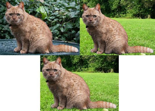
A special effect is the highlight of this section in Chapter 7 of How to Cheat in Photoshop, 6th ed. But, first, author Steve Caplin teaches three different shading techniques for skin tones, all of which are now staples in my repertoire.

Dodge and Burn
Although my CS3 course had a tutorial on using the Dodge and Burn tools, they were only for restoring old black & white photographs.  Using the tools on skin tones is trickier, but can have very satisfactory results.  Just one critical note: these tools permanently change an image.  Once done, and the image file closed, the changes cannot be undone.  So, definitely  work on a duplicate of the original layer, just in case someone decides they don’t like the outcome.

As for the technique, Caplin suggests making  using low opacity brushes along with a combination of both the Dodge and Burn tools, set once to highlights and once to midtones.   In the image pair below I used Caplin’s technique to create a more striking appearance:

168 - Shading Dodge & BurnBoth The image on the left was photographed with neutral lighting.  As Caplin instructed, I added  subtle shading and highlights for a more visual interest.

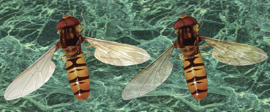
Adding Some Drama With Light Modes
In this tutorial Caplin shows how three light modes  – Hard Light, Soft Light, and Overlay – can produce a Hollywood-style lighting effect.  Much as theatrical lighting creates drama by using colors, Caplin suggests using various color and light mode combinations to do the same for still images.  In the pair, below, I used his techniques to create the image on the right from the neutrally lighted figure on the left.

170 - Shading Light modesBothUsing a dark blue shade for the shadows, a purple one for the midtones and an amber shade for the highlights, Caplin shows how each combination looks with the three different light modes.  The image I created on the right uses Soft Light mode for a muted effect. However, by using Hard light for one or more of the layers, a more dramatic effect can be attained.

Reversing Shading With Curves
The next technique is one I’ve use over and over again in Friday Challenges.  When combining different images to create a new composite, more often than not the images will have different light sources.  A sure sign that an image has been produced by combining two, or more, separate images is having lighting that appears to come from different directions. Such inconsistent lighting is a common error. So common that Caplin frequently dings people for it in his critique of their Friday Challenge submissions.

However, correcting lighting issues has many real-work applications.  For example, creating a balanced image of an individual such as U. S. President Barack Obama:

172 - Reversing ShadowsThreeUsing curves layers, I created to both the neutral in the center and the right lit image of Obama, on the right, from an image that was originally lit from the left. By using Curves as an adjustment layer mask, instead of working directly on the image, the shading can easily be adjusted if you need to go back and do so.

Smoke Without Fire
Now, for the special effect I told you about. In this tutorial, Caplin teaches readers how to realistically add smoke.  Again, using layers in different light modes and the Clouds filter to add texture, Caplin created an image with a lot of smoke billowing from all the stacks in the version he used in How to Cheat in Photshop.  It’s my experience that refineries, at least around here, tend not to  produce copious amounts of smoke during daylight hours so as not to enrage the public.  Thus, my image is more subdued:

174 - Smoke without FireBoth

Next: Light and Shade – Part 4: Explosions, Neon and Day Into Night.

Light and Shade – Part 2

If Steve Caplin had stopped at creating relatively simple shadows in How to Cheat in Photoshop, 6th ed., it would have been far more than most people learn from most Photoshop books.  Luckily, he continues with the art lessons, giving readers increasingly  complex shadow skills. As the great Renaissance painters taught us centuries ago, it’s correct shadows that ensure images look realistic.

Stacking the Deck
Making a stack of cards could require as many layers as cards, but Caplin teaches otherwise as seen in this example:

The original card looks flat and unrealistic.  Note how adding a shadow under each card makes the stack look three-dimensional.   It would be a clever trick, as is. However, Caplin goes further by explaining how to create the whole stack on one layer, thereby making a much smaller file. He also teaches readers how to use QuickMask mode along with the Levels control dialog box to get rid of unwanted shadow areas.

What’s more, Caplin doesn’t just use this technique once and never come back to it.  Nope. In Chapter 10 How to Cheat in Photoshop readers use this technique to create realistic shadows for a stack of bills being cut by a meat cleaver.  But, more on that when we get to Chapter 10.

A Basket of Shadows
When objects are grouped together they will cast shadows on each other.  In the following tutorial Caplin shows how to use Hard Light layers  and the Burn tool to create editable shadows, while making the image  look as if it its a photo of basket filled with toys rather than a photo that’s been altered to include a bunch of images of toys:

162 - Shading on Hard LightBlogFirst the ball, book and blocks layers are selected. A new layer is created in Hard Light mode and filled with 50% grey.  However, since grey is invisible in Hard Light mode, the Burn tool is used on it’s layer, instead of the actual objects, to create the shadows.  Note how realistic the basket on the right looks compared with the original.

Lighting Effects
When trying to convey a lamp lighting a dark room, the light must be hyper-realistic.  A lit lamp just doesn’t look like the example on the left, below:

164 - Visible light sourcesBothThe original image was created using three layers.  Caplin demonstrates how, using QuickMask mode, to selectively blur the light and paint on the shadows. On the right, the image now looks as if the light had been turned on in a dark room.

Turn the Lamp On
The next example was an earlier Friday Challenge that Caplin incorporated into the 6th edition.  The challenge was to make a table lamp in a room lit by daylight look as if night had fallen and the lamp had been turned on.

166 - Turn the lamp onBothAgain,  I am thankful I did not have to work on this challenge without the instructions! Since everything was originally on one layer, it turns out that all of the elements must be copied to separate layers before the light can be added to create the desired effect. On the right is my nighttime lamp with the light “turned on.”

Next: Light and Shadow – Part 3

Light and Shade – Part 1

Two of the most important, and often overlooked, elements in a good photomontage are the shadows and the light source.  Here, again, my CS3 coursework failed me.  The CS3 textbook used only had one sentence on shadows in a three-paragraph section on how to make combined images look more realistic.  And, the course didn’t talk at all about light sources  at all.

Steve Caplin,  on the other hand, wrote 15 tutorials on the subject in his book, How to Cheat in Photoshop, 6th ed. Again, because I learned so much in this tutorial, I am splitting it up into several parts. 

Basic Shadowdry
The simplest shadows to create are along the ground and up walls.  In the first tutorial of Chapter 7 Caplin discusses fast and easy ways to create this effect. In the image below a simple shadow is added to the floor to make the two element image look more realistic.

152 - Shadows on wall and groundLong BothNote how in the image on the left the boy looks like he was photoshoped into the room because he appears to be floating just above the floor.  On the right, just the addition of the shadow places the boy firmly on the floor and in the room. Following Cpalin’s instructions I created the shadow  simply by duplicating the boy, filling that copied image with black, reducing the opacity, transforming the image and then adding a slight gradient so that the shadow would appear to fade as it got further away from the boy.  A bit of black shading was also added with a soft brush at a low opacity underneath his shoes.

The foregoing technique works fine if there is a large section of ground space.  However, subjects have an awful habit of appearing closer to the wall.  Caplin demonstrated how to do this in the second half of this tutorial as seen in the image pair below:152 - Shadows on wall and groundWallBoth

Once again, on the left the boy appears to float in the room, he’s just closer to the wall this time.  To remedy the situation, Caplin instructs his readers to use the Rectangular Marquee tool to select the top half of the shadow, where it meets the wall, and then transform the selection so that it has the proper vertical. Note how much more realistic this looks in the image on the right.

 Tricky Ground Shadows
Images don’t always allow for shadows to be created using the previous technique.  Sometimes due to the light source, or light levels, the shadow needs to be made only from part of the image.  The following image pair demonstrates:

154 - Tricky ground shadowsToasterOriginalBothIn the right image, the shadow was created by making a selection of just the bottom part of the toaster. To complete the shadow, the same process of creating a new layer, and filling it with black at a reduced opacity, was used.

Sometimes a shadow has to be created from scratch, as it were, by painting it in. This is seen in the following image pair:154 - Tricky ground shadowsClockBothIn the image on the right, first a shadow was painted directly beneath the clock and then one was painted behind the clock.

 Complex Shadows
The next tutorial came from a previous Friday Challenge and, judging by the 26 images from submissions, no one got it completely right.  I’m glad I wasn’t part of the forum at that time!  This would have been very tricky to figure out:

156 - Complex ShadowsBothlIn order to create the shadow in the right image, Caplin instructs to first select the lenses, make a copy, fill them with black, and then reduce the opacity by using the Fade dialog box.  Next, he instructs adding to the selection the sunglasses frame and filling it with black.  Now comes the trick. Instead of trying to transform the sunglasses shadow as a whole, Caplin instructs his readers to separate the glasses into  three pieces: the frame with lenses, the far bow and the near bow.  Then, transform the pieces separately.  However, he also says to discard the near bow shadow and make a duplicate of the far bow. This is because the light source is from the side and it would be easier to get the correct shape using a duplicate of the far bow.  As I said before, I am thankful I wasn’t a forum member for this challenge.

Light From Windows
Instead of shadows, light is the focus of the last tutorial from Caplin’s book I’m going to discuss in this blog post, using the following images:

158 - Light from WindowsOriginal

The image on the left is perfectly respectable and looks like something out of an interior design magazine. On the right, the added light as if coming from out doors that throws window pain shadows makes the room look as if something dramatic is about to happen. Will Philippa receive Alistaire’s letter in time to prevent her from marrying Harold? Will Reginald’s love for Fiona ever be returned? And, what about Naomi?

Next:  Light and Shade – Part 2

Getting Into Perspective – Part 3

Finally, we have come to the end of Chapter 6 in How to Cheat in Photoshop, 6th ed., by Steve Caplin.  Next week I promise more Friday Challenges.   However, there’s still more perspective to learn so let’s get to it.

Vanishing Point Filter, Part 1
This filter is something unique in computer software. It allows for a two-dimensional image to be moved, copied, and cloned in three-dimensional perspective.

While I can’t say my CS3 course didn’t mention this nifty filter, I can say it didn’t get much coverage.  In fact, the only mention was a call-out box saying there was a filter that could be used for correcting the perspective of an object with multiple planes, such as adding a duplicated window to a building:140 - Vanishing Point filterCompositBlogThe original image in the upper left has lots of planes but none of them are square on.  In the Chapter 6 tutorial, Caplin shows his readers how to clone the upstairs window in perspective.

First, the perspective grid is set up, using the Vanishing Point Filter, as seen in the upper right image.  Next, the marquee tool is used to  select the window, as seen in the bottom left image.  Then, pressing the shift and Alt keys enables a copy of the window to be dragged to the left in perfect perspective.

Vanishing Point Filter, Part 2
Even more amazing, is that the perspective grid can be dragged to the side of the building.  This enables the window copied, in perspective, to the side of the building too:

VanishingPoint2 Side GirdAs seen on the left, the perspective grid is dragged around the corner. Then the window is duplicated using the same technique as before and dragged to the side of the building. On the right, Caplin has instructed the reader to insert an image file of graffiti, however this same technique could be used to add a logo or other image to a building.

Cropping in Perspective
Sometimes, instead of creating or manipulating perspective, you simply want to get rid of an existing perspective. It turns out the crop tool has a perspective check box. It turns an image that is in perspective at an angle to be cropped so that the angle is removed as seen below:

144 - Perspective cropOriginally, the picture was photographed at an angle to keep the flash from creating glare on the glass.  The right image shows the perspective angle is removed after checking the perspective box on the crop tool and adjusting the crop boundaries accordingly.

A Piece of Cake
In the final tutorial of Chapter 6, Caplin once again uses a past Friday Challenge image.  The Challenge was titled “A Piece of Cake” because Adobe had sent Caplin a cake on the 20th anniversary of Photoshop.    Below is the original image and how I completed it:

146 - A piece of cakeBoth

The Challenge then, and in the tutorial, was to cut into the cake and show it with a piece missing.  While Caplin did not supply the interior of the cake slice for the tutorial ( I searched for a suitable one online) he did supply the directions. This was far more assistance than the forum members originally received for this exercise, proving its sometimes wise to wait for the second slice.

Next: More Friday Challenge Fun

Getting Into Perspective – Part 2

Last time I discussed how to determine simple and complex perspectives for images built “from scratch” as demonstrated in Chapter 6 of the book, How to Cheat in Photoshop, 6th ed. To recap, the chapter teaches artistic lessons, not just software functionality. In this post, we’ll take things several steps further.

Correcting Perspective
Below, How to Cheat author Steve Caplin demonstrates correction of a two-element street scene consisting of a truck and its background:

130 - Correcting perspectiveBlog2CompletedAt the top left, the original image looks “photoshopped” because the truck is not in the same perspective as the rest of the image. To create a realistic image, first  the perspective lines for both the background(red) and the truck (yellow) are applied. Additionally, there is a green the horizon line.  Note how the vanishing points (where the two red lines and the two yellow lines intersect) are very different for the truck and the background.

On the bottom left, the truck’s perspective lines are brought into alignment with the background’s lines using Free Transform.  Unfortunately, there is still a big problem with this image.  While the front of the truck is in perfect perspective with the background, the back of the truck looks completely distorted.  To remedy this, just the back end of the truck was selected and Free Transform applied, with a shadow added underneath the truck.  In the finished image on the bottom right, the truck looks like it belongs on the street.

Fixing Wide Angle Objects
Sometimes an element would be fine if it were in the front of a composition, but looks unnatural when in the back. Here, Caplin uses a car to demonstrate:

132 - Fixing wide angle objectsBlogBy using Free Transform and Image Warp the car can now be placed farther back in the image.

Using Existing Perspective
In the previous post I discussed the importance of the horizon. However, most of the time an image doesn’t have a clear horizon.  When that is the case, look for hints in the image to figure out the perspective.  For this tutorial Caplin used an image drawn from an early Friday Challenge entitled “Open the Door:”

134 - Existing perspectiveBlog2

In the top right image, the door is removed and the perspective inferred by Caplin using the bookcase on right wall (red lines) and the table, picture frame and skirting boards on the left wall (green lines).

On the bottom left, I added a hallway image I found online, transforming to fit the perspective lines Caplin provided in the book.  Then, I worked on the door. I cutout the door panels, added frosted glass, the narrow side and the hardware. Finally, I added a shadow behind the door.

The bottom right shows the completed image, without the perspective lines.

Boxing Clever: Doubling Up
For the next lesson Caplin uses a cash box to demonstrate how to increase the height by making a copy and placing it in perspective on top of the original. The technique can be used to increase the size of any rectangular object, such as an office building:138 - Boxing cleverBlogCompleted2

From the original image at the top left, the box is duplicated and the copy dragged directly above the original.  The sides and top of the box are then cut apart and put on separate layers, as seen in the middle image screenshot. Next, as seen in the bottom left image, the box components are individually adjusted to fit the perspective of the bottom box by using Free Transform.  The bottom right image shows the completed, double-height box.

While it’s clear Chapter 6 has much to offer, there’s still more perspective to be gained.

Next: Getting Into Perspective – Part 3

Getting Into Perspective – Part 1

Although my earlier CS3 course covered the mechanics of creating images, in Chapter 6 of How to Cheat in Photoshop, 6th ed.,  author Steve Caplin gives readers important fundamentals in art. These lessons make the difference for creating truly realistic images.

Like chapter 5, Caplin begins chapter 6 with an instructional tutorial, rather than a hands on lesson. But, a very important lesson in perspective it is.  Incorrect perspective is high up on the list of errors for Friday Challenge submissions.   Caplin’s Golden Rule is:

“The horizon is always at the same height as the eyeline of the viewer.”

While I had certainly heard of perspective, it was previously only a vague theory to me. Thus, I found this chapter highly instructional.

Introducing Vanishing Points
Before Caplin’s book if I heard the term “Vanishing Point” I thought of a 1997 movie starring Viggo Mortensen.  I knew the term had something to do with perspective but didn’t know what it meant. Caplin gives a very good lesson in both how to determine the vanishing point and the use of repeat transformation as seen in the following series of images:

124 - Introducing vanishing pointsCombined images1In the top left image, the tops and bottoms of the store fronts make natural perspective lines.  In the top right image the perspective lines (red) have been added and the horizon line (green) has been calculated by drawing a horizontal line (hold down the shift key and drag horizontally) from the point were the perspective lines cross back to the left side of the image.  Note how the people’s heads in the background are intersected just as in Caplin’s rule.

The bottom left image shows the added elements (security guard and first row of the shutter). They are duplicated in perspective by using Free Transform repeatedly.  The bottom right shows the completed image.  Caplin did provide the shutter element in the exercise, but the technique he used to create it isn’t explained until Chapter 12.

Two Point Perspective
When I was in grade school I used to spend time in class doodling boxes.  I didn’t know how to create them in perspective and sometimes they came out looking more like crushed boxes.  In this tutorial Caplin shows how to box up a cow realistically and create a Damien Hirst-style image.

126 - Two point perspectiveCombinedIn the original image, besides the cow and one side of the box, Caplin also provides a nice clear horizon to help his readers create the perspective lines.  In the top right image, the perspective lines have been drawn and turned into a selection and filled. This is because copies of the side of the box will need to be distorted along the perspective lines using Free Transform and paths must be turned into objects or they will distort too. This is an important fact to remember because the final Chapter 9 tutorial requires making another Hirst knock-off. However, in the later tutorial the reader not only must draw the perspective lines, but the sides of the box must also be drawn as well.  The bottom image shows the cow neatly boxed up.

Three Point Perspective

If I had heard the term “three point perspective” before this tutorial, I would’ve thought it had something to do with an op-ed piece in a newspaper.  Not so. When an image you need to create isn’t at “street level,” that’s when you need to use the three point perspective technique.128 - Three point perspectiveCombinedThe left image demonstrates the type of perspective lines that need to be drawn.  Since the angle is now off the actual horizon, the verticals in the image will no longer be straight up and down.  An additional vanishing point is needed either above the object (if it is being viewed from below) or below it (if it is being viewed from above).  The right image shows the completed box as if it were being viewed from one of it’s top corners looking down.

That’s enough for now. As this chapter was so full of new concepts for me, I’m splitting it into three posts. Nest time I’ll cover correcting the perspectives when combining elements into one image. Stay tuned!

Next: Getting Into Perspective – Part 2

Composing the Scene – Part 2

As discussed in the previous post, Chapter 5 of How to Cheat in Photoshop, 6th ed., is more about learning than doing – at least compared to the chapters that come before. The first three tutorials provide valuable information about working with figures (the human kind, not numbers).

Urban Farming
In the fourth tutorial of Chapter 5, Caplin finally provides an exercise to work on. In this case, he explains that just placing a figure in a background is rarely convincing.   To make figures look like they actually belongs in an image, it’s usually necessary to have the figures interact with the background in some way. Take this image:Back to foregroundBothOn the left, the farmer looks artificially inserted. On the right, notice how the farmer looks much more convincing. Not only is the farmer behind the fence, his feet are in the grass (instead of on the grass) and the pitchfork he’s holding is now on the other side of the fence.  In addition, the background is blurred, using a gradient, to give the image more depth.

Making it Work
When you’re trying to get a message across in an image, you’d think the best way to do so is by making it the most prominent item. However, that in-your-face approach is about as subtle as a slap, and frequently less effective.  Instead, adding other elements can draw the viewer’s attention to the right spot: composition tricksBothOn the left, the sign with the message is in perspective with the rest of the image and it’s the most prominent feature. But, due to the perspective, it appears to be pointing towards the statue in the background.  Very distracting.  On the right, the background is moved and blurred and a figure added (which, according to the book, is a picture Caplin himself). Now the focus of the image is clear.

In the Driver’s Seat
The final tutorial in Chapter 5 involved placing a figure in a car.  It seems like this ought to be an easy enough. But,  there’s the windshield and the interior of the car to deal with.  Caplin shows how, in nine steps, to take car from empty to occupied (and appearing to be driving down the street, too):People and carsBothThe first few steps cover removing all of the glass, including the sides and rear windows.  Next, a new interior, driver and steering wheel with a hand are added.  The car and new driver are then placed in another background that matches the perspective of the car.  The windshield and other windows were added by painting diagonally, in white, with a soft-edged brush set to a low opacity. Finally, the car was recolored by filling a new layer with blue, using the car as a clipping mask and then erasing the parts that didn’t need to be colored and a shadow added underneath. I could have also fixed the dent in the hood, but if someone makes it a habit of speaking on his mobile phone while driving, he probably has a few dings on his car.

Of course this exercise is drawn from an older project of Caplin’s. In a modern photo, the man would be texting. But, that project will have to wait for another day…

By the way, for the American audience, the driver seems to be on the wrong side of the car.  Keep in mind that Caplin is from the UK.

To summarize these last two posts: the Chapter 5 tutorials offer far more lessons on the art of photo montage than all of the content in both of the books used by the curriculum in my previous graphics courses.  So, don’t skip the first three just because there aren’t any exercises to work “on.”

Next: Getting Into Perspective

Composing the Scene – Part 1

In How to Cheat in Photoshop, 6th ed., Steve Caplin doesn’t just provide tutorials on how to use the software. He also spends considerable time explaining the art of creating a good photomontage.

For example, of the six tutorials in Chapter 5, the first three don’t present any exercises.  Instead, each tutorial contains valuable information about positioning figures in a scene, combining figures and varying the positions of the figures in association with one another to create relationships between them. In addition, the discussion includes the subtle effect of eye contact – or lack thereof – and how it can alter the entire meaning of an image.

Ascending the Mountain
Below is an illustration of the importance of placement. On the left, the climber has his goal in sight.  On the right, there is still a daunting challenge in front of him:LocationBoth

It’s All Relatives
Next up, combining figures for good storytelling:

Relative valuesCompositeOn the left, the two individuals are not relating to each other at all.  For all we know, they could be two people at a crosswalk waiting for the light to change.

In the center, with both individuals flipped horizontally and the addition of the man’s hand on the woman’s shoulder, we now have a picture of a proud, but perhaps protective, father and his affectionate, albeit somewhat stroppy, daughter.  (For you Americans in the crowd, the British term “stroppy” roughly translates as ill-tempered. Caplin, is after all, British.)

The image on the right tells a completely different story.  Although it’s still a father/daughter story, the daughter is separating herself from her father as all children eventually will. For his part, Dad is showing concern, possibly due to his daughter’s growing independence.

The Eyes Have It
In the next three images, the only thing different is the placement of the eyes. But what stories they tell!

I only have eyes Composite

On the left, the gentleman is clearly happy about winning the trophy he’s holding, but the woman is non-committal.  In the center, the man looks as if he can’t believe the trophy is his, while she looks totally bored.  On the right, he’s looking to see whether winning the trophy might win her as well. Her expression, on the other hand, reveals he hasn’t got a shot.

Even though there wasn’t an image to work on in any of the above examples, skipping them would have meant losing out on some valuable lessons on image composition.

Next: Composing the Scene – Part 2

Throwing Some Curves with Image Adjustments – Part 2

As we learned in the previous post, the final “basic skills” chapter in Steve Caplin’s  How to Cheat in Photoshop introduces key techniques extensively used in photomontage. Next, Caplin demonstrates that he expects his readers have systematically followed the book thus far.

Major Color Changes
This lesson uses both a Hue/Saturation adjustment and Curves adjustment to change a black Mini Cooper into a red one with a British flag on it’s roof, a la Michael Caine’s film The Italian Job.  It’s also the first lesson where How to Cheat in Photoshop leaves out specific instructions. For example, Caplin gives hints in the steps for creating the Union Jack, but leaves it up to the reader to know how to complete the task.  I’m sure people who expect an author to provide them with all the necessary lesson components were cursing Caplin, and perhaps even throwing his book against the wall, when they attempted Step 6 (see below). I grumbled a little, myself. Then I realized that, in real-world situation, Caplin most likely would not be there to tell me what to do.

Step 6 reads: “Now for the flag. The roof is selected from the red layer, and made into a new layer; then desaturated using the Command-Shift-U (Mac) or Control-Shift-U shortcut.”92-Major-color-changesExamples-1024x543

Note that Caplin says “the roof is selected” leaving it up to the reader to determine which selection technique to employ.  I chose to use the pen tool, as I am quite comfortable with it. (See blog post Pixel Perfectionist – Part 1; First Encounter: Photoshop 7). I also used the pen tool for Step 10 where he instructs: “The red portion of the flag is created by drawing it’s outlines, and then deleting that area from the white roof to reveal the read coloring that’s already beneath it.”

I did have one bone to pick with Caplin about this project. Step 11 discusses creating the license plate using a certain font most people are not likely to have on their computer, as well as a technique not covered until Chapter 10 – Metal, Wood and Stone.  I also had to go onto Google Images to find “GB” sticker image.  Actually, I didn’t complete this lesson until I reached the “Metal with Layer Styles” lesson in Chapter 10, at which point I also uploaded a similar font from the Internet. It seemed a bit unfair that Caplin didn’t supply layers with the license plate and the sticker to for this lesson in Chapter 4. Maybe he was just trying to weed out the wanna be photomontagists from the serious students. But I digress…

Selective Hue and Saturation
Sometimes an image is almost perfect except for one element being a little too bright or dull.  Such as in the case of the original of the image below:OS20069

It’s been possible to select a broad range of colors using the Hue/Saturation adjustment in many previous versions of Photoshop.  However, starting with CS4, it’s been possible to click and drag directly on an image to change only selected colors.  This is demonstrated in the “after” image, where the technique enabled lowering the red saturation in the boxer’s gloves and robe without drastically affecting his skin tones.  His shorts were also re-colorized to more closely match the new robe and gloves.

Natural Healing
Back in the post Just Thumbing Through I hinted at the power of the Healing Brush. In this chapter I learned the basics and a solution to a common problem.  The Healing Brush works by using the texture of the source area and then blending that with the lighting of the target area.  This works just fine if the target area only contains pixels of a similar hue and saturation. However, when there is a sharp difference, the Healing Brush produces an unsightly bleed as it tries to combine the pixels. My CS3 course did not address this shortcoming.  However, How to Cheat in Photoshop does.

In the example below the model had her blemishes removed by sampling a clear spot on her forehead and painting over the blemishes. This works well for all blemishes except the mole on her right cheek. In the middle image, notice how that “fixed” area includes white bleeding through from the background:100-Natural-HealingExample-1024x530

Caplin provides an excellent solution:  select that area of the face, subtract the white background and then apply the Healing Brush.  The image on the right shows the result.

As you can see, this chapter taught me a lot. I’ve used all of the techniques in Chapter 4 to complete subsequent lessons and the Friday Challenges. Speaking of which, stay tuned for more Challenge fun next week!

Next: Friday Challenge – Madge Triumphs

Throwing Some Curves with Image Adjustments – Part 1

Although it’s the last “basic skills” chapter in How to Cheat in Photoshop by Steve Caplin, “Chapter 4 – Image Adjustment” introduces some key techniques are used extensively in photosynthesis. I learned so many new skills in this chapter that I’m splitting it into two blog posts to cover them all.

Shadow/Highlight
Another example of a technique that was available in CS3, but not covered in my CS3 class, is the Shadow/Highlight Adjustment dialog box. It can be found under Image>Adjustments. Below, I only used the default setting to considerably brighten the background without washing out the statue:86-Shadows-Highlights-1Example-1024x462

However, images often need further adjusting, such as in the next series. In the original image the sky was so bright that the camera compensated by making the rest of the image too dark to keep the sky from washing out. In the second image, the default Shadow/Highlight Adjustment setting lightened the other elements but not quite enough. For the third image, the picture is greatly improved by increasing the amount and tonal width:86-Shadows-Highlights-2-Example-1024x650

Now let’s consider the opposite problem. In the original image, below, the woman’s face is fine but her white coat is too bright and looks washed out.  The default settings take care of the coat but also darkens the woman’s face too much. Finally, reducing the tonal width in the Highlight section a balance between skin tones and coat can be achieved and the picture vastly improved:86-Shadows-Highlights-3Example-1024x653Throwing Some Curves
A far more powerful tool is Curves. This is yet another tool that was not covered in my CS3 course even though it was available all along. Curves are tricky to master and I’d wanted to learn to do so ever I saw an Adobe demonstration video on the technique in the spring of 2011. I purchased How to Cheat, in part because I could see Caplin covered Curves extensively. If you don’t know how to use Curves, it’s worth purchasing the book to learn this technique alone.

One attribute of Curves, unlike the Shadow/Highlight Adjustment, is that the technique can be used as a Layer Mask. This means that the original pixels are not changed or lost. If necessary the original image can be recovered.While HotChiPs (How to Cheat in Photoshop) devotes two tutorials to Curves in Chapter 4, almost all the following lessons use Curves as one of the steps. The first tutorial demonstrates how, in nine steps, Curves can be used to take a dull image and make it into a bright one. Here is the original and the result:88-CurvesExample

The second tutorial demonstrates how the Curves technique can be used on a problem that commonly occurs when combining two or more separate images: Variations in tone and color cause the completed image to look like it was composed of separate elements. Here’s an example. In the original image on the left, the man’s hand is the correct size for his face. But, the face and hand clearly don’t belong to the same body. The right-hand image demonstrates how to use Curves in five steps to change the tone, contrast and brightness of  the hand to make it more closely match the man’s face:That’s enough of Chapter 4 for now. Tune in next week when a drab Mini Cooper gets a flashy 90-Matching-colors-with-CurvesExapmlesnewmulticolor paint job!Next: Throwing Some Curves with Image Adjustments – Part II

Hiding and Showing

Of the first 4 chapters in How to Cheat in Photoshop  6th ed., by Steve Caplin Chapter 3: Hiding and Showing has by far been the most useful to me.

The chapter covers two very important technique: Clipping Masks and Layer Masks. Every one of my Friday Challenge submissions required at least one, if not both, of these techniques. Plus, most of the future lessons in How to Cheat in Photoshop also require mastery of these skills.

While my CS3 class did include a lesson covering both Clipping Masks and Layer Masks, neither of these techniques was touched on again. So, I didn’t understand the usefulness of them until I started working through Caplin’s book. However, now that I do understand them, Masks are near the top of the usefulness scale for all the skills I’ve learned thus far. That and Curves, which I’ll discus in a later post.

Well Suited
Caplin only has one tutorial on Clipping Masks, which he combined with a demonstration on layer modes. When I ran through this lesson, I did not immediately see the utility of it. That would come with later chapters when Clipping Masks are used extensively.  The two images below cover the gist of the lesson.

 
The lesson started out with a gentleman and an image of what looks to be Victorian era wall paper:Clipping Mask Original
The instructions are simple enough: Create a clipping mask. Below are the results with the wallpaper layer changed to various modes.  Some actually look like they could possibly be worn by a man, although I’m not sure in what situation it would be appropriate.Clipping Mask - with Layer Modes

Unlinking a Layer Mask
As mentioned, my CS3 course covered layer masks, but it never discussed unlinking one. Being able to move an object behind a mask is very useful when creating a photomontage. In fact, I’ve used the unlinking technique in every Friday Challenge so far.

Here is Caplin’s example:Original Layer Masks 1

 
Now, let’s say you’ve been given the assignment to put the man behind the desk for a corporate brochure. Here’s how it looks with the basic Masks technique:Layer Masks 1EditedOriginal
This is as far as my CS3 class went. I know because I went back and checked the book.

But now let’s say your boss (or client) wants the man to stand between the desk and the chair. With the basic Masks techniques, moving the man would move the desk as well.

As Caplin teaches, click on the chain icon in the layers panel to remove the link as follows:Unlink Mask
With the link removed the man can be moved and the desk stays put. The man can be move behind the desk as long as that desk section was masked. Otherwise he would just pop out in front of the desk again.Layer Masks 1Edited

A Soft Touch for More Realism
There’s even more I learned about Layer Masks from Caplin’s book. For example, while most layer masks are created with brushes, it turns out any of the painting tools can create a mask in order to make the image look more realistic.

Consider this original image:Layer Masks 2 Original

Note in the layers panel, the image is composed of three separate elements: a “people” layer, a “sky” layer and a “grass” layer.  Notice how it looks like the people are floating above the grass. Also, the sky and the grass come together along an unnaturally hard, straight line.

 
Layer masks can be used to fix it like this:Layer Masks 2 Completed

First, the sky was masked using a gradient, making the horizon line look more realistic. Also, an inverted mask, that has been streaked with the smudge tool to simulate blades of grass, has been applied to the people to give the appearance of being on the ground rather than hovering above.  Finally, a new layer was added to create a shadow under the people.  Note how the couple now look as if they really are lying in the field. Why they are doing so is still a mystery.

Masking Using Color Ranges
My CS3 course can’t be faulted for not covering color-based masking as Adobe didn’t introduce the technique until CS4.  Like the background eraser tool, a range of colors can be selected to be removed from the image. But the big difference is that nothing is permanently erased. It is only hidden.
Take this image:Layer Masks 4 Original
What if you want to give it a more dramatic background? No problem. Using a mask and the masks panel, you can select the color range for the blue sky and that area will be masked. This allows for adding the desired background:
Now that’s dramatic!Layer Masks 4EditedMtFuji

Blending in Some Fire Power
The final technique I’m going to discuss from  How to Cheat in Photoshop, is blending. This really isn’t a mask. But it does fit in with this blog’s theme of hiding and showing.

Take this original image:Blending options 1Original

It consists of three elements: The hand holding the gun, a picture of lit fireworks that has been rotated on its side and a background that looks like a library. Caplin wrote that whenever he thinks of gunshots, libraries come to mind. I concur. If a firearm must be discharged indoors, it should be in the library.

However, to make this scene look real, the black box around the fireworks needs to be removed.  It could be removed using one of the previous Masks techniques. But, there is another way. By using the Blending Options dialog box, under Layers>Layer Style, nothing gets erased, it just gets hidden. This technique definitely wasn’t covered in my CS3 course despite the capability being there all along.

Here is the image after adjusting the Blending Options:Blending options 1Edited

Now it’s ready to insert into that Who Done It? story you’ve always dreamed you’d write!

Next: Throwing Some Curves with Image Adjustment

Transformation and Distortion

is post is a little longer, but it’s photo-rich and a quick read. So, don’t be afraid to scroll down.

Chapter 2 of How to Cheat in Photoshop, 6th ed., by Steve Caplin is similar to Chapter 1 in its concentration on more “basic” techniques. But, like the previous chapter, there is also a surprising amount of new material. Most of the really new and interesting stuff is located under the Edit menu.

Free Transform and Image Warp
Almost every time two or more images are combined in Photoshop, at least one will need to have its perspective changed to make the composite look realistic. This can be achieved by using Free Transformation and Warp, both of which are found under the Edit menu and have been available since CS2. Free Transform allows for perspective changes on both horizontal and vertical axes. Warp (found under Edit-Transform-Warp) enables distorting an image in numerous ways, including creating the appearance of going around a curve.

For example, say you needed to add the poster image on the left to the three sigh boards on theater image on the rightTransformation in practiceOriginalAllSimply scaling the poster just doesn’t fit, especially around the curved side of the building for the middle sign board. And, you can’t put the poster on the right-hand signboard at all:Transformation in practicePostersUnrealistic
However, using Free Transform to scale the left and right posters while applying Warp to the middle poster yields a much more realistic result:56 - Transformation in practiceEdited
Further realism can be achieved by changing the mode of the layer from Normal to Overlay.

New in CS5: Content-Aware Scaling, Content-Aware Fill and the Ruler tool

Content-Aware Scaling
Let’s say you have a picture like this with some boring “blank” space in the middle:Content Aware ScalingOriginal
You need to add this picture to a publication, but space is limited. Simply cropping the edges causes the loss of interesting subject material. Previously, your only option was to crop out the middle, move the two ends together and spend hours hiding the join. Now, with Content-Aware Scaling, you just scooch the ends together without an unsightly join to remove:58 - Content Aware ScalingEdited

Content-Aware Fill
I have to admit I stumbled on to this new feature before encountering How to Cheat in Photoshop. However, because I tried to figure out how to use it on my own, I didn’t get a good understanding of this tool.

Content-Aware Fill has many useful applications for professional and home photography. For instance, you’re visiting an exotic tropical location and you want a picture of a pristine beach. So, you head out early in the morning to get the shot. But, darn it, someone is already there!beachOriginal
No sweat. Using CS5, just make a gross selection of the people using the Lasso tool then under the Edit menu go to fill and select Content-Aware in the dialog box and press OK. Presto-Chango! Now you’ve got the beach all to yourself!EmptybeachNote that with some types of photos you might also have to do a little work with the healing brush and the clone stamp tool, but at least Content-Aware Fill has done most of the grunt work for you.

The Ruler tool
Another addition to CS5 is the Ruler tool, which is located under the Eyedropper. It takes the guesswork out of straightening a crooked photo. And, combined with Content-Aware Fill can make even a skewed photo look professional. Here’s an example:

Oh dear, it looks like the ocean is going to pour right out of the picture!Content aware fillOceanViewFirst, use the Ruler tool to draw a line that matches the horizon and press Straighten:Content aware fillOceanViewStraightenandCroppedBut, with only the tiny bit of sky at the top, it looks as if a giant tsunami wave is about to crash down upon the viewer. YIKES!!

Fortunately, the Ruler tool is actually a two-step process. Undo just the last step. See how Photoshop tilted the picture to level the horizon as specified:Content aware fillOceanViewStraightened
Now, with the Magnetic Lasso tool draw just inside the perimeter of the image and inverse the selection to capture the white area. Then, select Content-Aware Fill and voila! Photoshop fills in the white area, and everyone stays safe and dry:62 - Content aware fill 2Edited
Also new in CS5: Puppet Warp

What a great innovation Puppet Wrap is. Often, an image would be just perfect if you could just move an arm, make it look like the subject is looking up, or even move the subject’s fingers. Now, you can do this without spending hours, or days, putting each element on separate layers, fiddling with Image Warp, joining everything back together and then trying to make it look seamless. What a nightmare!

Puppet Wrap is also located under the Edit menu. With it you can create life-like changes in an instant.  It works by creating a “mesh” in which you insert “pins.” The trick is inserting the pins at natural joints. Take this open hand:Front&back
Using the miracle of Puppet Warp, it’s closed:Front&back

Here’s another example. Say you wanted to make this rhea, a South American flightless bird similar to an ostrich, look as if it’s about to pluck some fruit off a tree.rhea
Simply place a pin at the base of the neck where it joins the body, a pin where the neck starts to curve up, one at the base of the skull and one at the tip of the beak. Now alternately drag the pins at the base of the skull and the beak until the rhea is looking up at the proper angle. Finally, place your rhea in the background and now you have a bird caught in the act of stealing some fruit:AppleTreeWithRhea

Natural Selection

This blog post chronicles my progress learning new Photoshop skills from the book How to Cheat in Photoshop, 6th ed., by Steve Caplin, and my Friday Challenge submissions to the Forum linked to the book.

Back to Portfolio Page

As explained in my post Pixel Perfectionist – Part 2“, I intended to dig into How to Cheat in Photoshop, 6th ed., by Steve Caplin when my temporary job at LGS Recreation ended December 2013. However, I didn’t get down to business until mid-January 2014. Sure, I had excuses like the Holidays and then a bought of Swine Flu. But my real reluctance was due to the first chapter covering selection techniques. After all, making selections is SO basic. I began to question all the great reviews I’d read before I bought the book.  Was I wrong! When I finally did buckle down, I discovered that How To Cheat in Photoshop offered a wealth of little tricks in every lesson. Here are three from Chapter 1.

Trick #1 – Black vs. Grey10 - QuickMask 2Flies

Both of these flies were selected and copied from a plain white background using my favorite selection technique: Quick Mask. On the left, I selected the fly using a traditional black, hard-edged brush.  On the right, I also used a black, hard-edged brush for the fly’s body, but the transparent wings were created by using a 60% grey brush, hard-edged, except for the veins in the wings. They were still selected using the black brush. Clearly, the right-hand fly looks much more realistic against the background. This technique was available way back in Photoshop 7, but neither of the books I learned from for Photoshop 7 or CS3 mentioned this trick.

Trick #2 – Combining Quick Mask & a Soft-edged Brush8 - QuickMask 1Blog

On the left is the original image. On the right, I made a selection using a Quick Mask with a soft-edged brush of just the deeply shadowed area on the right side of the man’s face. Then, I lightened just this selection with a curves adjustment layer. The Soft-edged Brush allows for making the adjustment without creating an unnatural-looking hard line.

Trick #3 – Selecting with Refine Edge & Refine Radius
A couple of lessons in Chapter 1 did provide me with completely new skills. Both lessons covered the Refine Edge dialog box that accompany the Quick Selection tool. This is new in CS5. One of the best things about this dialog box is how it allows for the capturing fuzzy edges such as in the example below:16 - Refine EdgeBlog3Cats

The cat on top left is the original. Note all the little tufts of fur sticking out from the edges of the cat. The image on the top right reflects life before the Refine Edge dialog box – note the unnaturally smooth edge of the selected cat’s rounded back. Prior to Refine Edge, adding in the tufts required selecting each hair – beyond tedious! I selected the bottom cat  using the Refine Edge dialog box’s Refine Radius tool. Note how the wispy bits of fur make this cat look much more like it belongs in the grassy field. Adding a shadow and pulling some of the grass up around the cat’s feet would create more realism, but that would wait for later lessons. Suffice it to say, How To Cheat in Photoshop had my attention. I was impressed to learn such valuable tips even when the lessons seemed to cover only the basics.

Next: Transformation and Distortion

Back to Portfolio Page